Admiral
Category
ArtAbout This Project
CHARIS DEVELOPMENTS
Admiral Collingwood Place
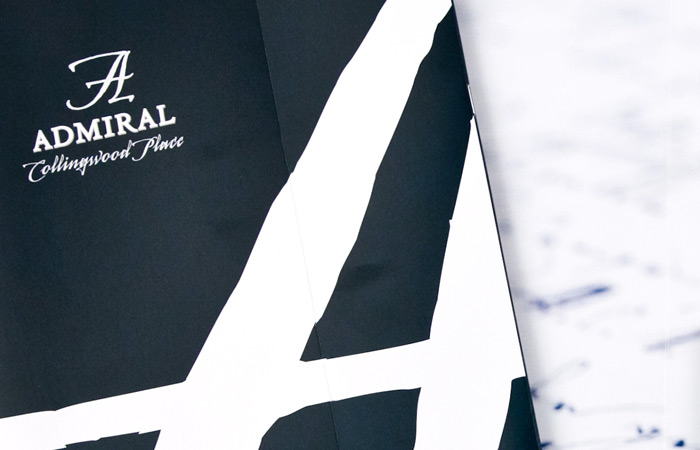
Logo, which drove the design for this project. Harkening back to the era of Admiral Collingwood, the project features a scripted font reminiscent of calligraphy from that era while the design on the ‘A’ icon evokes a windswept feeling similar to the winds that blow off Georgian Bay.
A silver motif was used to create an air of sophistication for this high end condo.
The inclusion of more refined features such as printed velum sheets in the brochure also helped reinforce the impression that purchasers were buying into a truly sophisticated condominium project. Wooden post and beam ceiling details and robust stone columns.


